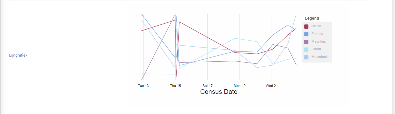
Line Chart
This widget is used to show a standard line chart.
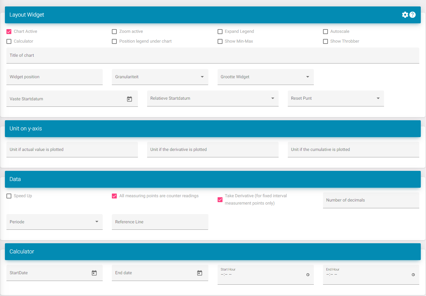
Settings
Chart active: Activates the widget in the dashboard.
Zoom active: Adds a bar underneath the graph where you can select an area to zoom in on. You can then drag this.
Expand legend: This increases the space underneath the widget allowing more datapoint to be visible without a scroll bar.
Calculator: Adds a new field to the line chart. Here you can find the min, max and average of each datapoint. This is configurable on the bottom of the page so I will not explain it separately. This is to configure what period is being looked at when calculating this. This also comes with a button next to the download button to show this for the currently selected period and the added rescaling that was done to show it in the graph. The calculator on the bottom will take the raw data of the measurement.
Position legend under chart: This positions the legend under the graph is case this is wanted.
Show min-max: This shows the min and max for each measurement.
Show throbber. You can turn this on if you want to see the loading icon when new data is sent to the portal.
Title: This is the title of the widget.
Widget position: This is the position of the widget in the list on the dashboard.
Widget size: This is if you want to see multiple widgets next to each other.
To know what to select you need to see the dashboard as 12 divisions. Here is a list to see how much divisions a size takes:
XXL: Full size/ standard; 12/12
XL: 10/12
L: 8/12
M: Half; 6/12
S: 4/12
XS: 2/12
Set start date: This sets the start date so when you load this chart it will always start on that date.
Relative start date: This makes it so you can see for example: last weeks data. Without you having to always press the button to go back.
Units on y-axis: This will edit the value of the unit when the conditions described in the fields are met.
All measuring points are counter readings: If you select this you will see a new button to calculate the values based of the counter reading.
Take derivative: This works if the option above is turned on. This then calculates the values already without you having to press the button.
Number of decimals: Here you can choose how much decimals are shown.
Period: Select what the standard period is when the dashboard is loaded. Ex. Month so when you open the dashboard you don't need to edit it so it shows data for a month.
Reference line: This will take a value and create a line on the chart. This can also be used to set the max of the y-axis (chart will scale to where the reference point is. If the values are greater then the reference line this won't happen).
Calculator: Here you can configure the date of the calculator on the bottom if this option is turned on.